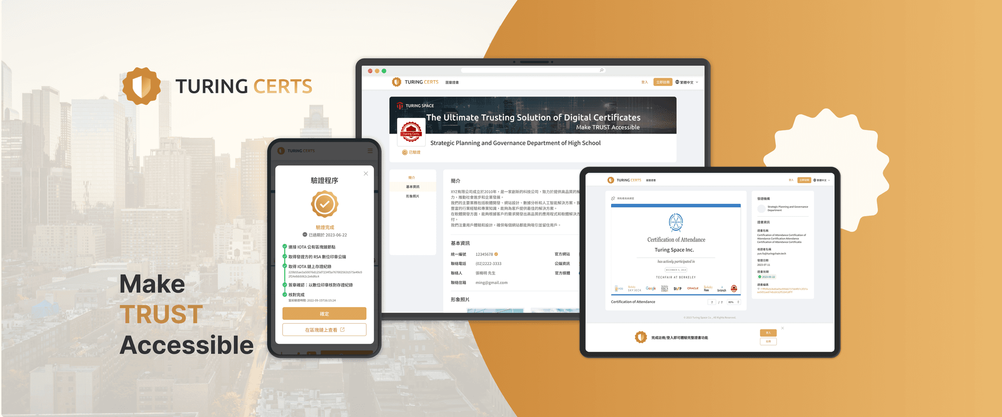
Turing Certs - Updating the certificate collection process and registration guidance
My Role
Product Designer
Team
2 Product Designers,
1 Product Manager,
2 Front-end Engineers,
2 Back-end Engineers
Skills
UI Design, User Flow, Competitor Analysis, RWD
Duration
Jun-Dec, 2023 (6 months, Officially launched)
I was responsible for breaking down issues into actionable tasks and optimizing the login process, linking, and user experience for certificate recipients (proposed 10+ design concepts). During all phases of the project, I worked closely with the project manager and engineer to ensure high-quality results.
Summary
Goal
To help recipients understand the value of digital certificates, encourage them to register on the platform and share their certificates to create a more efficient digital application experience
Solution Design
Onboarding - Guiding users on follow-up actions after receiving their certificate
Management - User control over certificates based on identity levels
Impact
• an increase in the registration rate (11.3%)
• a decrease in customer support emails
• highly positive feedback from certificate recipients
Click the button to access the new website
Introduction: Seamless Credential Verification and Sharing
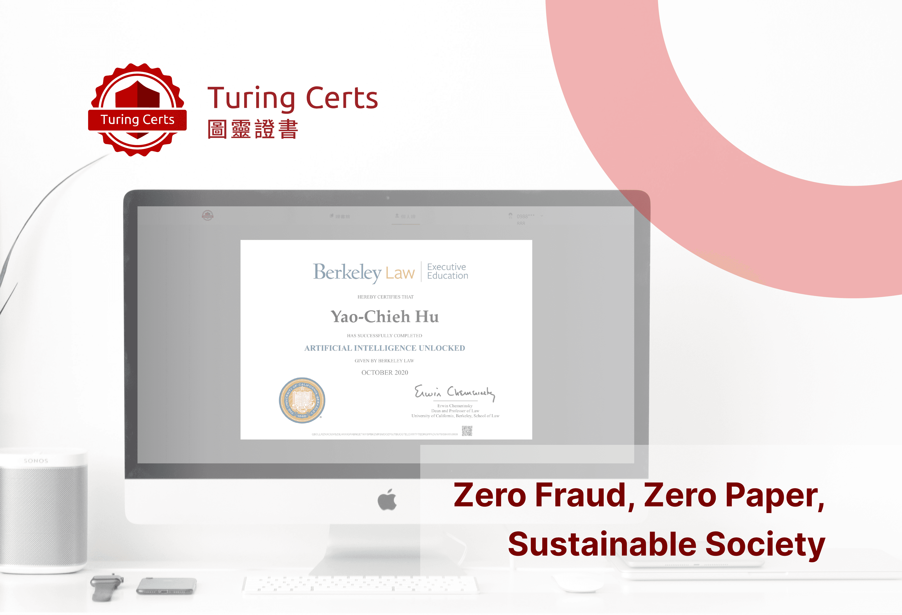
TuringCerts leverages blockchain technology to ensure permanent certificate preservation, efficient verification, and convenient management and display for recipients.
Problem: Addressing Certificate Usability and Mobile Experience Challenges
Low utilization rates of the certificate features impacted issuers' perception of the product's value, lowering their renewal interest.
Goal: Personalization and Responsive Redesign for Enhanced User Experience
Enhance user satisfaction with the initial experience and refine feature design to improve operational efficiency.
Process: Identify to Hand off Design
Strategy
Analyze the existing user journey (touch points and behavior patterns) → Identify pain points and key issues -> Conduct competitive analysis → Propose optimization solutions
Click the link to access the whole competitor analysis process
RWD User Flow & Suggestion
I began by analyzing user experiences in existing workflows to identify pain points. Based on these findings and in combination with competitor analysis, I proposed suitable solutions.
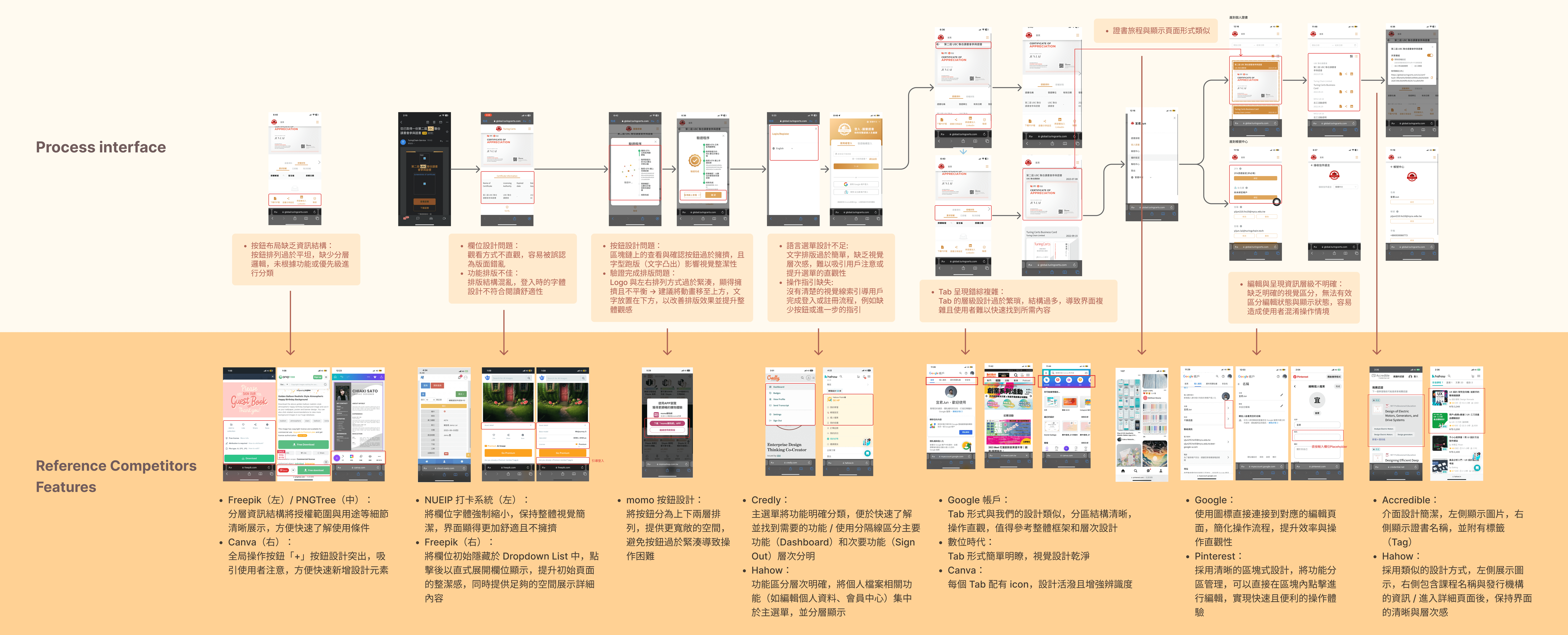
Flow Chart
The pink section represents the optimized user flow, focusing on key steps to guide users toward registration, including soft reminders and reinforcing needs.
Design
Refine
Onboarding - Guiding users on follow-up actions after receiving their certificate
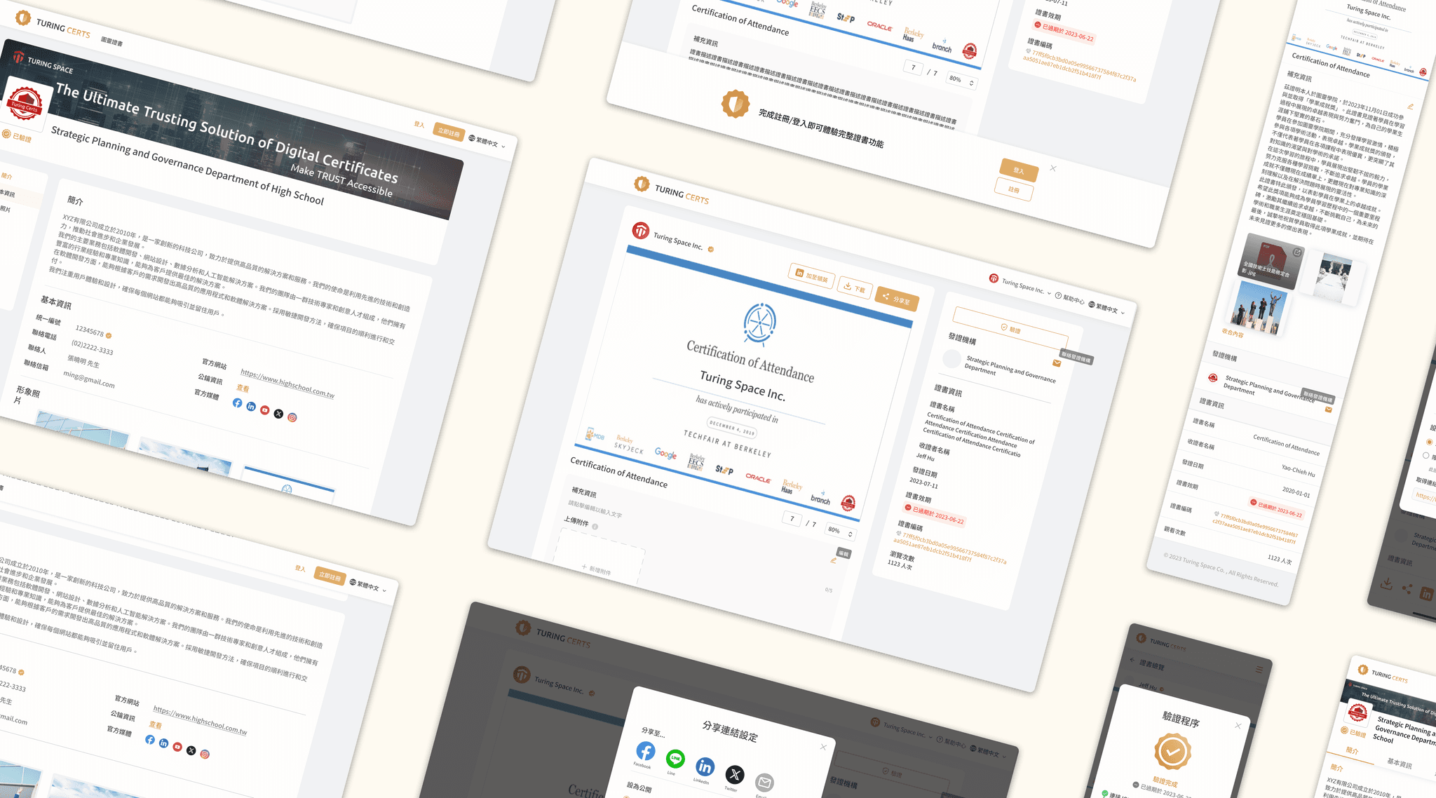
Optimized onboarding flow by guiding users to register, log in, and link their email, highlighting benefits like downloading, managing, sharing, and verifying certificates.
General User Link
Entry via Certificate Email
Management - User control over certificates based on identity levels
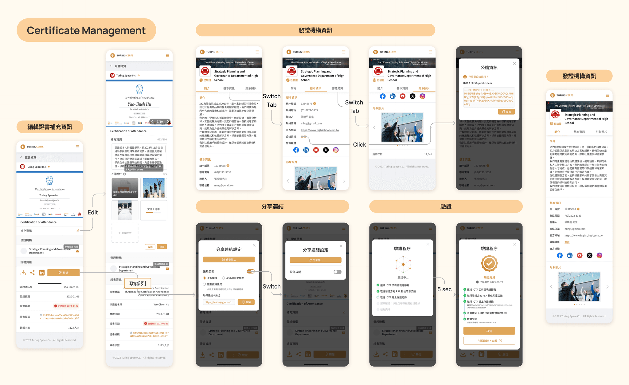
Linking an email allows the system to offer personalized features (e.g., text descriptions, image uploads) with flexible certificate management and access to detailed information about issuers.
RWD
During the design process, I organized user pain points to enhance RWD features. Below are the highlighted pages:
Stage 1 - Guiding users to link certificate and login.

Stage 2 - Providing users with flexible certificate management.
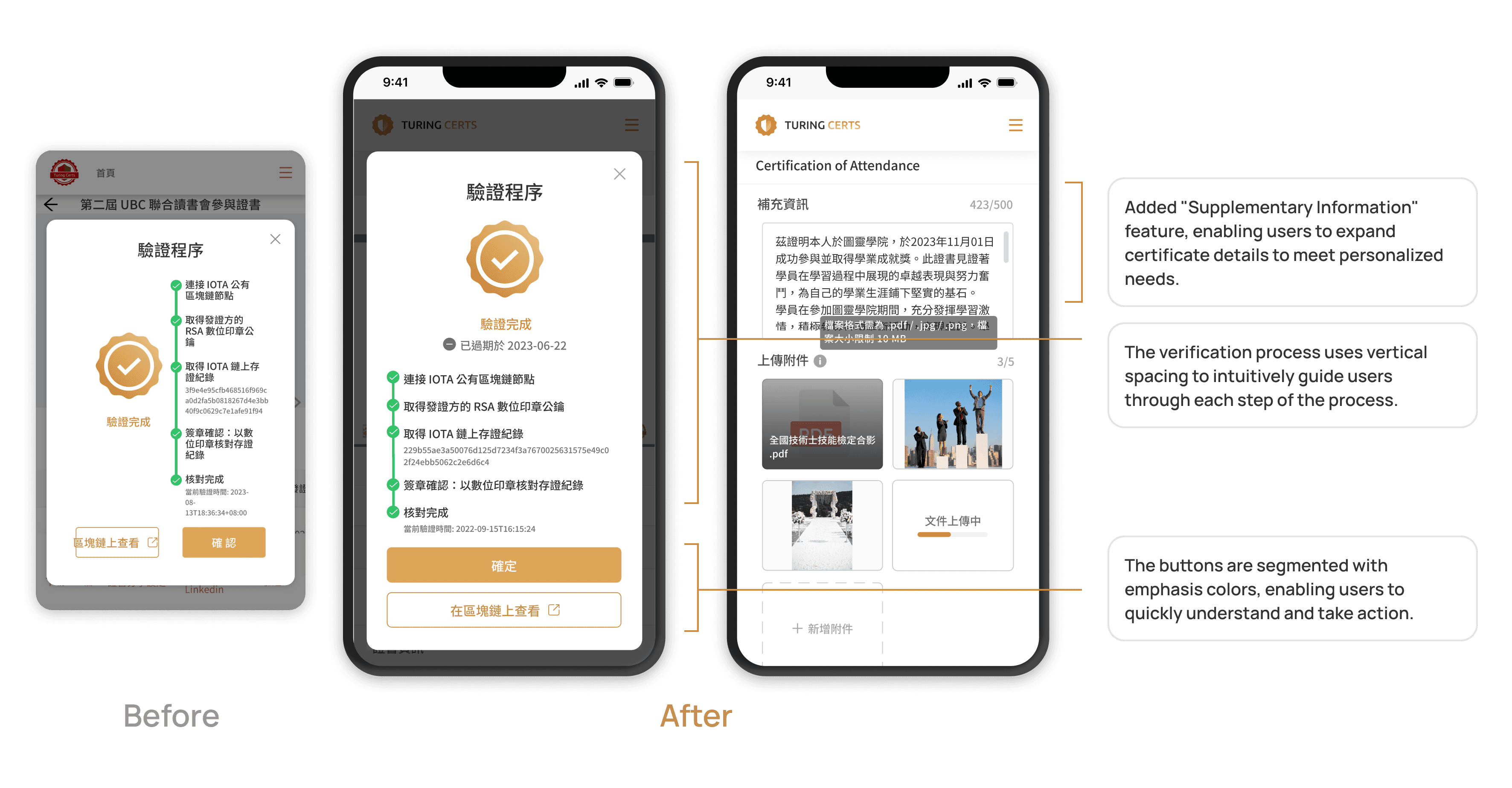
Iteration
Takeaways
Observation, Analysis, and Experimentation
This project focuses on enhancing onboarding flow and personalized user experience.
By observing user behavior and analyzing competitors, I identified key pain points and evaluated feasible solutions.
During this process, I learned the importance of avoiding banner blindness(廣告識盲) while ensuring a seamless and intuitive flow that effectively guides users toward their goals.
